How to change the end-user interface appearence
If you’re looking for a way to change visual and functional properties of the user interface that your readers use to navigate through and interact with your edition, look no further. The Workflow’s Appearance section contains heaps of options that enable you to quickly and easily achieve the look you’re after. The options are organised in three sections: Layout, Interface, and Toolbar. The majority of these options are represented graphically so it’s immediately apparent how they will affect the user interface, but you can always click the Preview button to test the changes before you save them.
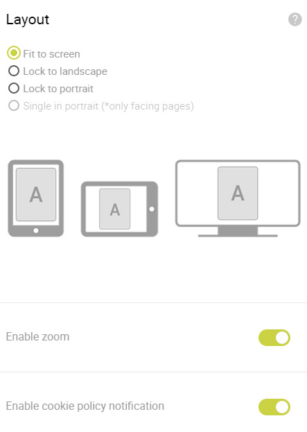
Layout: This feature enables you to select how your edition will occupy the available area within desktop and/or tablet browsers as well as native app. You can select from the following options:Fit to screen, Lock to landscape, Lock to portrait, Single in portrait.
Enable zoom: When this switch is green, readers will be able to increase or decrease the zoom level of your edition by using toolbar buttons or finger gestures on touch screens. To disable this feature, flip the switch so it’s grey.
Enable cookie policy notification: When this option is enabled, your readers will notice a cookie icon in the left-bottom corner while exploring your edition. Although it looks really nice, the main purpose of this icon is to inform your readers that cookies are being used to track their actions so you can improve the user experience of upcoming editions. Clicking on the icon also enables them to read the whole cookie policy.
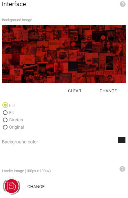
Background image: If there is a specific image that you want to have visible in the background of your edition, click within the dotted line rectangle and select it from your device. Or just drag-and-drop the image inside the dotted line rectangle.
Below the image there are a few options for you to select how it will occupy the available area.
Select Fill if you want the image to cover the whole browser window at all times. The proportions of the image will stay unchanged, but the image will be scaled depending on the browser window size. Select Fit if you want the whole image to be visible at all times. The proportions of the image will stay unchanged, but the image will be scaled to fit the browser window height or width. Select Stretch to stretch the image in order to cover the whole browser window. Select Original to center the image and display it in the original size.
Background colour: Using using the color picker you can quickly pick out a background colour that will work with the design theme of your edition.
Loader image: If there’s a specific image you would like to appear in the center of the loader animation, click within the dotted line rectangle to select it from your device. Or simply drag-and-drop the image inside the dotted line rectangle. The suggested image dimensions for the loader logo are 100px by 100px. Larger or smaller images will be resized to fit the available area.
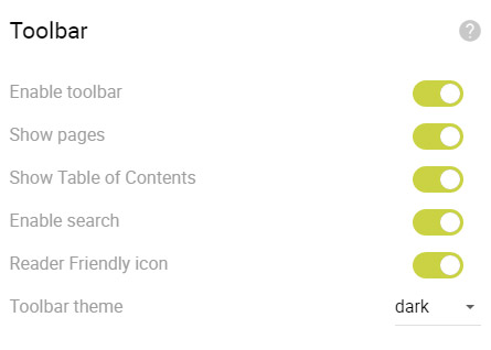
Toolbar enabled: Don’t want the toolbar to be visible? Easy. Just flip the switch so it’s grey and the toolbar will no longer appear. You can re-enable it at any time.
Show pages: Using this switch you can decide if you want the toolbar to contain a section of all the page thumbnails for easier navigation.
Show table of contents: Using this switch you can decide if you want the toolbar to contain a section of just the pages from the Landing pages section of the Workflow that have the “Show in TOC” option checked.
Enable search: Using this option you can enable or disable the search functionality. This is very useful if your edition contains lots of text so your readers can easily find what they’re looking for. What’s more, we gather search statistics which is then visually presented in the Analytics section.
Reader friendly icon: This option will be available only when a mobile version of at least one page is present. By enabling this option, you are adding the Reader friendly icon in the toolbar, which allows your readers to switch to the mobile version, when viewing this edition on larger screens - smaller screens will automatically display the mobile version.
Toolbar theme: If the default toolbar theme isn’t complementing your edition, you can easily select a different theme from the drop-down menu. In addition, you can create your own theme by selecting the Custom option and picking out colors of individual toolbar segments.
Our system also enables you to create a completely custom toolbar using our API, but you’ll need to have a basic understanding of HTML, CSS, and Javascript.
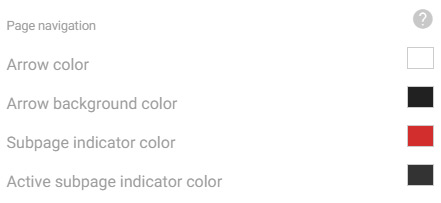
Arrow color: Using the color picker, you can quickly pick out a navigation arrow colour that will work with the design theme of your edition.
Arrow background color: Using the color picker, you can quickly pick out a navigation arrow background colour that will work with the design theme of your edition.
Subpage indicator color: Using the color picker, you can quickly pick out a subpage indicator colour that will work with the design theme of your edition.
Active subpage indicator color: Using the color picker, you can quickly pick out a active subpage indicator colour that will work with the design theme of your edition.